RoundHouse Kickboxing is a kickboxing club based in Cambridge. 

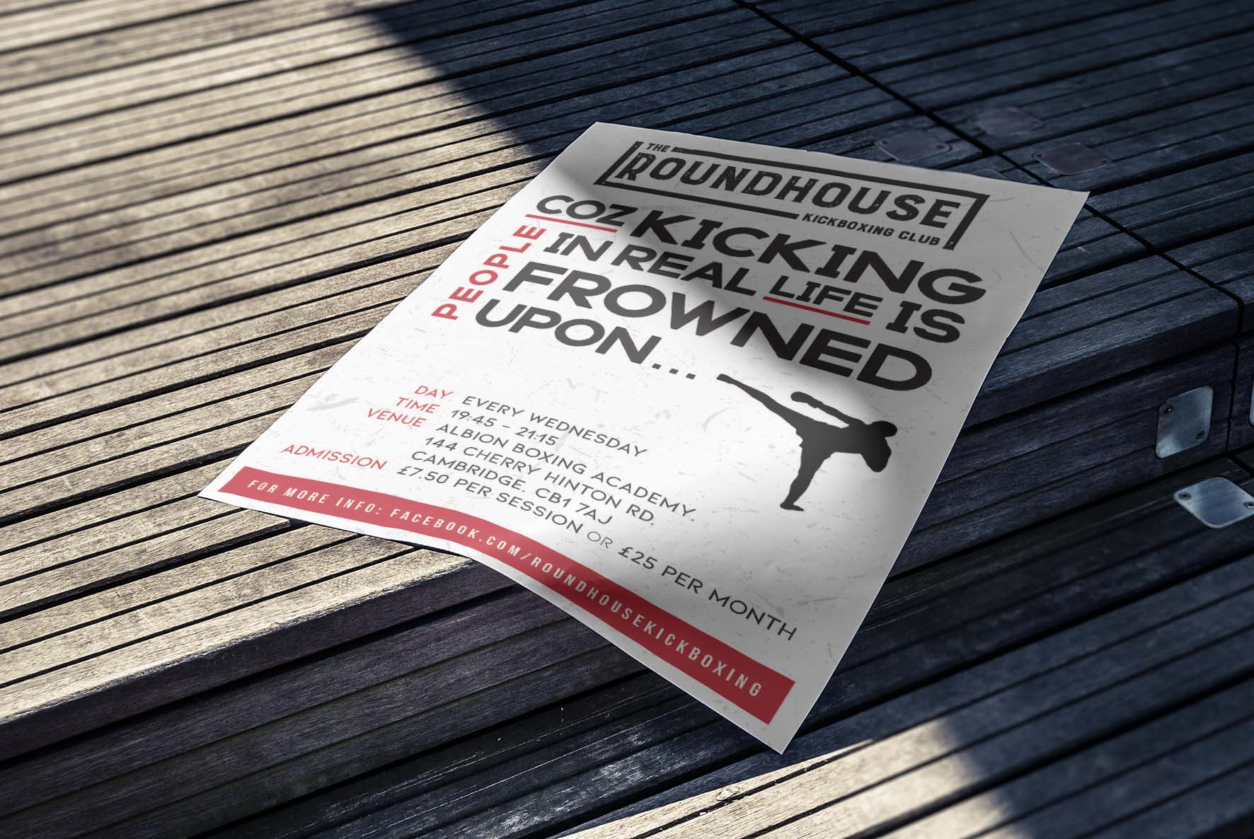
The client needed a logo and poster to promote the new club within his local area and gyms.

DISCIPLINES

BRANDING, SOCIAL MEDIA DESIGN

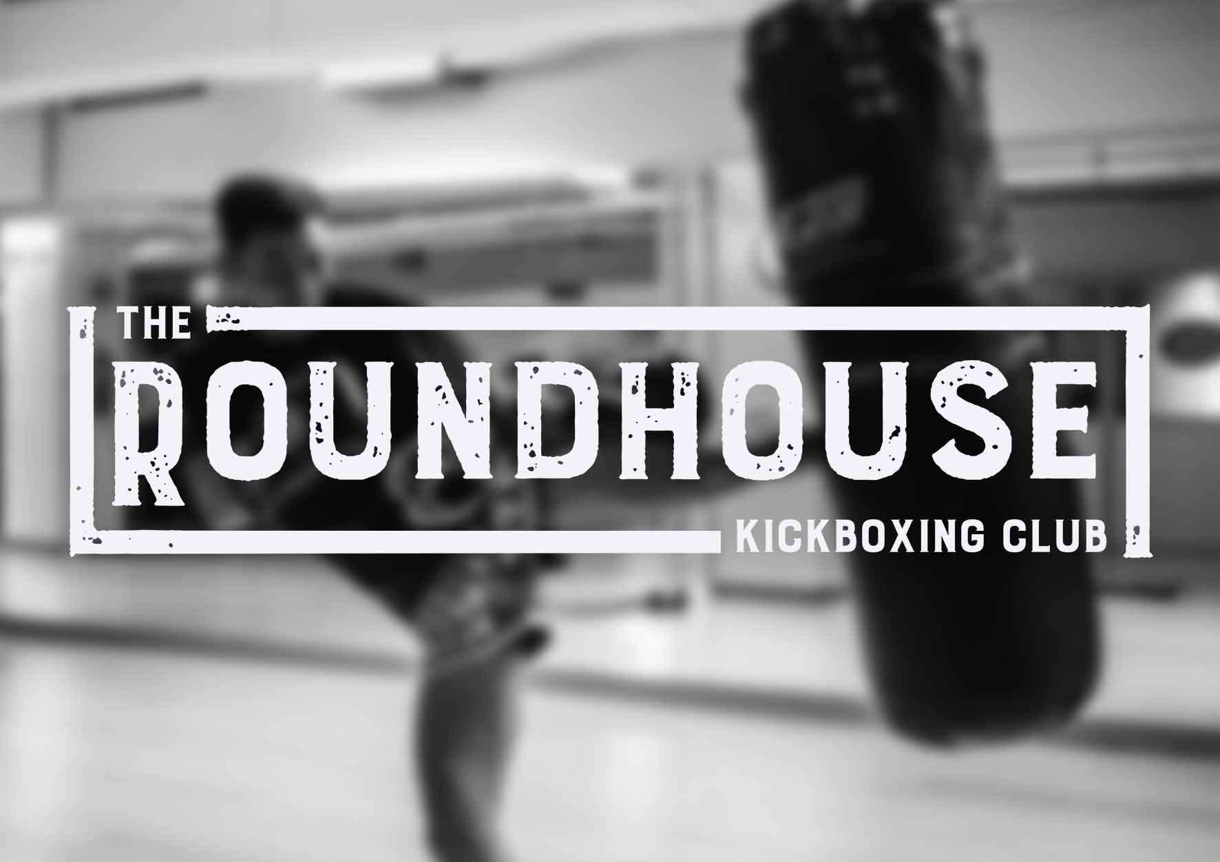
The typeface was selected and modified for its distressed and stamped appearance to reflect the kickboxing style; hard-hitting, bold and with a ‘punch’. 

The composition for the logo was based on a boxing ring. Strong outlines gives the feel of a bird eye-view of the ring and its opponents ‘The’ and ‘Kickboxing Club’ at opposite sides.

The poster brief was open to suggestion. Initial thoughts, were, that the viewers must read what the poster is about in a few seconds, to then be intrigued to know the finer details of where and when the club was on. 

Making words within the phrase more prominent enticed viewers to either continue reading, or read from the beginning of the poster, increasing the engagement of the audience.  

Click on the Facebook button below to be taken to The RoundHouse Kickboxing Club’s page.
What we’ve accomplished:

1.

The client required a logo word-mark for their new kickboxing classes. This had to represent the kickboxing industry and to be obvious without having the audience work out what the logo is about.

2.

We presented the client with 3 logo identities which matched the brief and the requirements for the project. Feedback was positive and straight forward to how the client would like to progress.

3.

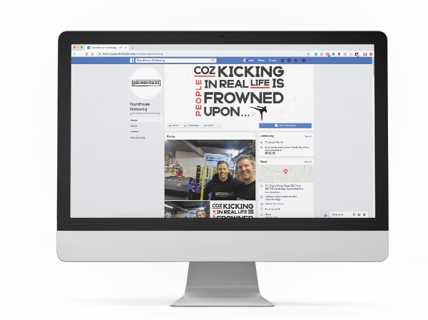
After a couple of iterations to the logo this was signed off and a poster was created to advertise the kickboxing classes, within the local community and gyms. The poster conception was then altered to fit within the Facebook header of the business page, to carry the personality of the brand through-out their online presence.